Biology Graphs: Waste in the United States
By C Roach
United States Solid Waste (percentages by weight) | United States Municipal Solid Waste |
 |  |
Directions and/or Common Information:
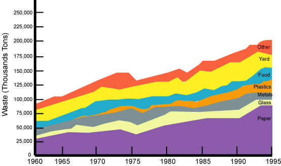
The following questions will reference the line graph at the top of this page.According to the top line graph, which type of waste is more prevalent, food or glass?
Although there have been several slight drops for each material over the years, there is one year in which the drop was evident in all 7 types of waste. In which year did this occur?
In general, the amount of each type of waste has more than doubled since 1960. Why do you suppose there has been such a rapid increase in only about 45 years?
Directions and/or Common Information:
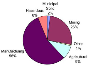
The following questions will reference the two pie charts at the top of the page.What percent of the country's waste is hazardous?
Which of the following is a more prevalent form of waste, manufacturing waste or mining waste?
The second pie chart represents one slice of the first pie chart. Which slice do you suppose this is and what percent of total waste does it make up?
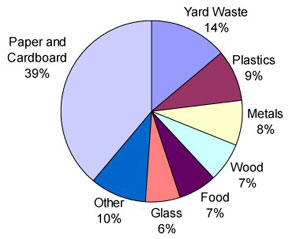
Read the titles of each slice in the second pie chart. Based on what these slices represent, what do you suppose would be a more common description for municipal solid waste?
What item makes up the largest portion of municipal solid waste? Which makes up the smallest portion?