Biology Graphs: Primary Air Pollutants
By C Roach
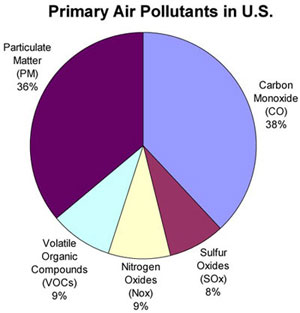 | 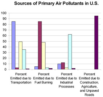 |
The pie graph above breaks down the different primary pollutants that make up the majority of air pollution in the United States. The bar graph displays the sources of each of these pollutants and at what percentage they occur for each source. For example, nearly 95% of particulate matter (the dark green slice and bar) originates from the "construction, agriculture and unpaved roads" category, while only about 5% comes from the three other categories.
Directions and/or Common Information:
The following questions refer to both the pie graph and the bar graph above.Carbon monoxide makes up about what percentage of air pollution in the United States?
Which source emits the majority of volatile organic compounds?
Which three primary air pollutants are emitted in a large amount from transportation?
Sulfur oxides, nitrogen oxides, and volatile organic compounds make up what percent of total primary air pollution?