Biology Graphs: Age Structure
By L Chapman
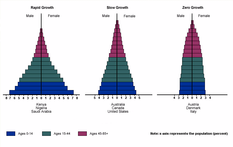
Age structure diagrams show how a population is distributed. It divides the population into pre-reproductive, reproductive and post-reproductive phases. The shape of the diagram can show you if a country is growing rapidly, slowly, or negatively. It can also show is there is zero growth. The wider the base of the diagram the more individuals below the age of fifteen. The more individuals under fifteen the more individuals poised to reproduce increases. The left hand side is always the males.
What percent of the population of Australia is under 15?
Which countries will have a problem caring for their elderly population?
Why is Saudi Arabia’s graph so different from Italy’s?